
Sometimes a picture paints a thousand words. So here are 2000 words to illustrate the physiologic differences between pepsi and, say, honey. My disclaimer is that isolated biochemistry is quite weak to prove ultimate causality; but more than sufficient to disprove similarity between two cohorts.
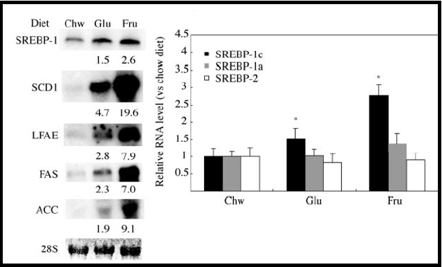
The first image comes from the University of Wisconsin published about 10 years ago in The Journal of Biological Chemistry. Mice were fed fixed diets of either 60% glucose or fructose for 7 days and then sacrificed to the life forces of science. The livers were isolated and the “expression” pattern of multiple proteins paramount to fat synthesis was determined by “Northern Blot” analysis. The relative darkness of the splotches correlates to the degree of activity. Lipid formation goes through the roof in mice who challenge the liver with preferentially high fructose diets, qualitatively shown on the left and quantitatively illustrated on the right.
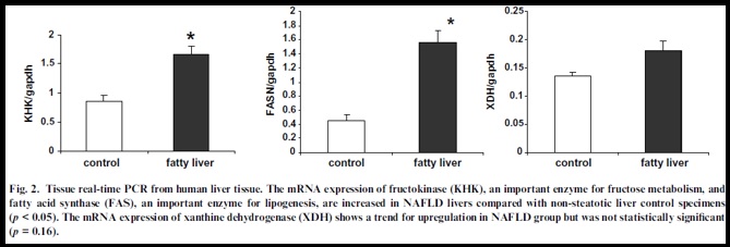
The second image is from a clever retrospective study published in 2008 in the Journal of Hepatology. 49 biopsy proven patients with fatty liver disease had “realtime PCR” analysis, a more sophisticated quantitative representation of DNA synthesis, from human liver tissue. Fatty Acyl Synthase (FAS) and phosphofructokinase (PFK), the latter being the key gateway enzyme in fat production from my prior post, are again highly expressed in these patients. Now one should never use such biochemistry studies to prove causality. But if they show physiologic differences between sugars at a basic level then one should be extra suspicious at a higher level.